Widgets on Android have languished for years, and that includes Google's widgets.
Android 12 may be bringing many under-the-hood improvements on privacy and permissions fronts, but it's also shaping up to be the biggest UI update to Android since the Material Design refresh back in 2013. Part of those changes hinge on the rumored theming system, but the ones that have me most excited are the alleged updated widget guidelines.
Google needs to give widgets a shot in the arm after getting absolutely schooled on how to do widgets properly by Apple last year in iOS 14. As with many features, Google did something first, Apple did it better, and now Google is playing catch-up, which is exactly why Apple's widgets were the best thing to happen to Android widgets. If you want the best widgets for your awesome Android phones, right now, you'll have to get down and dirty with DIY widget makers like KWGT, and that's no good for users or Google.
Of course, Android visual changes don't always take — Adaptive icons are still hit or miss after four years — but if Google leads the way with robust widget overhauls for its own apps, maybe other developers will actually follow through this time. And given the state of Google's many widgets right now, Google certainly has its work cut out for it.
Google Calendar: C
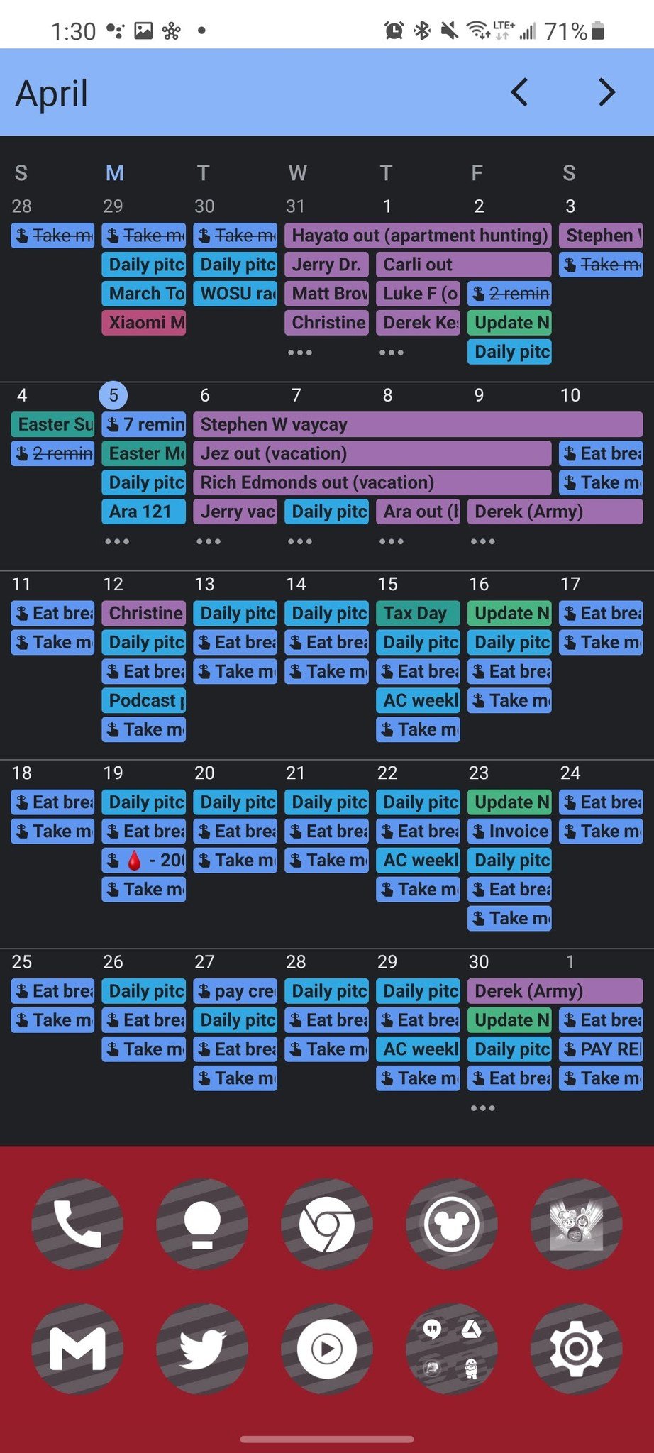
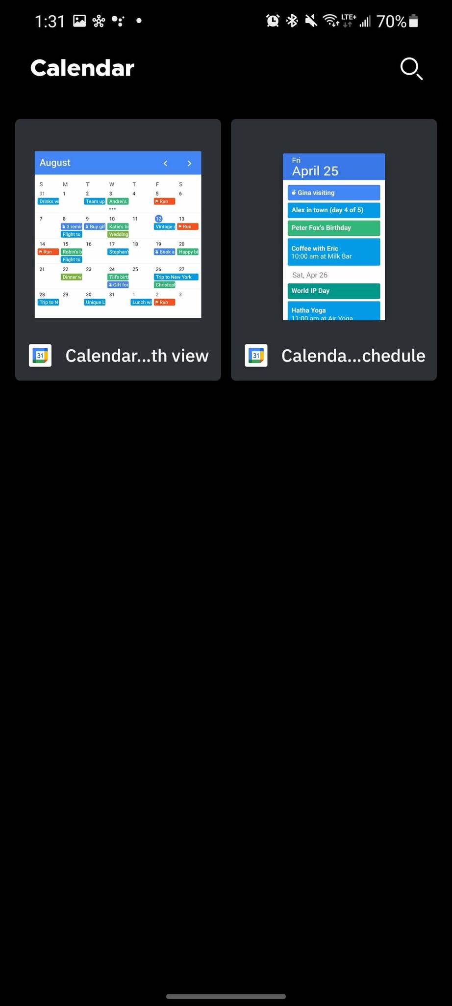
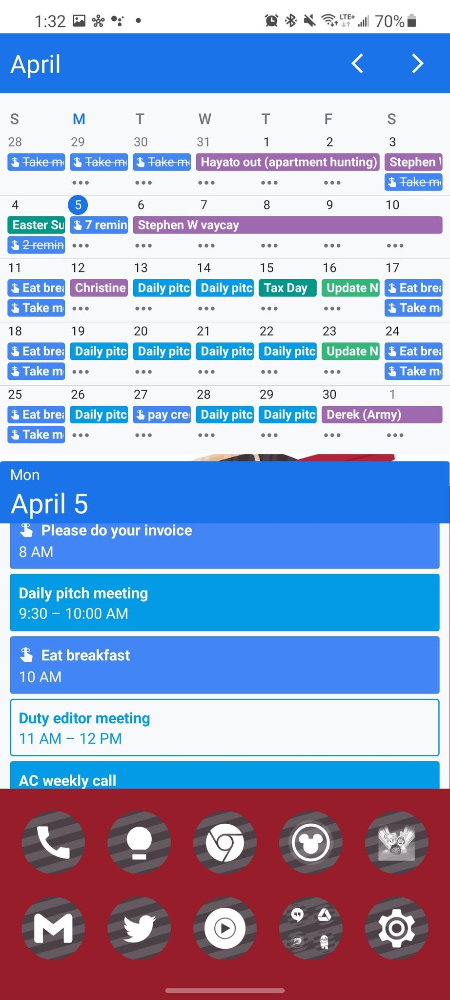
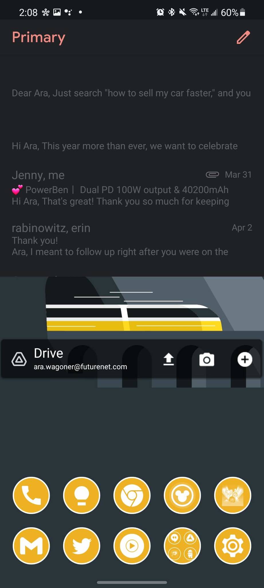
These are two of the most popular Google widgets on the market because of how crucial our schedules are to most workers. Among the widget Google needs to update most, Calendar is top of the list. These widgets have sharp corners, no transparency, and there's no way to limit certain calendars from the calendar so that it doesn't get ridiculously overwhelmed like the first image above. The month-view widget also needs a significant chunk of your screen, or else it loses all practicality: once you make it even a 4x2 widget, you can forget about seeing anything other than what day is what.
The schedule view widget is at least legible. It resizes to fill however much space you give it, and you can see all scheduled events, including all-day events. Both widgets need a visual update with rounded corners and a more glance-able form factor, but I doubt we'll see system-theming colors come here given how colorful Calendar already is.
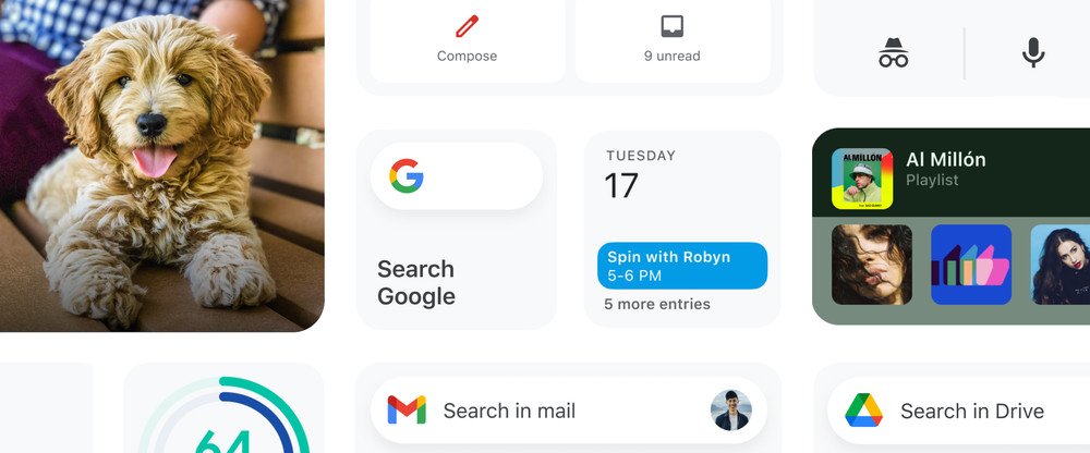
Google Chrome: B
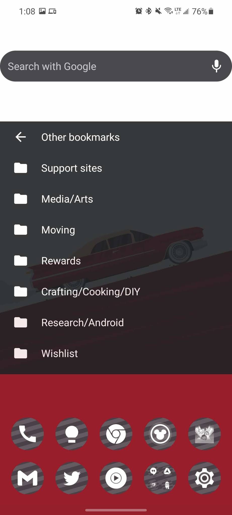
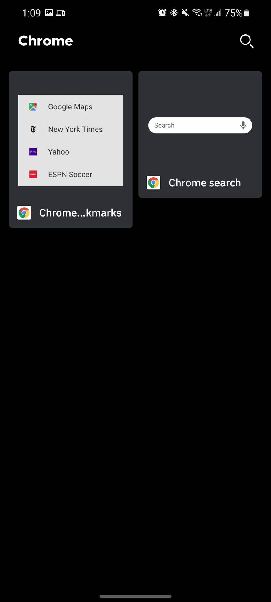
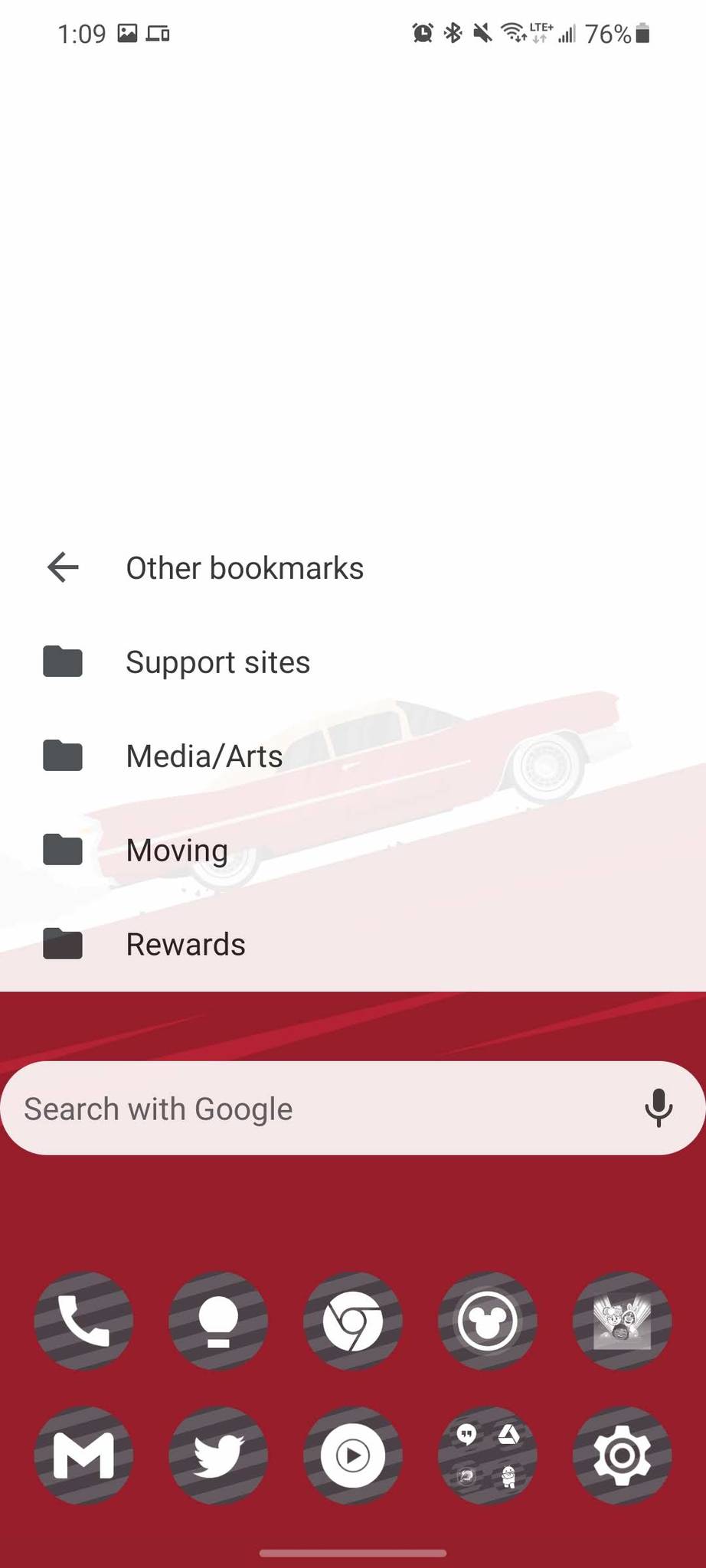
Chrome's two widgets are simple and straightforward: there's a search bar that will take you directly to the omnibar in Google Chrome when you click on it and a Bookmarks widget that'll let you browse and immediately open any bookmarked link — though it doesn't include the recently added Reading list. The Bookmarks widget will resize dynamically to fill the entire square or rectangle it's assigned to, and the search bar widget stretches to the side edges of the box it's assigned to. Both widgets swap between opaque white and charcoal grey depending on the system dark theme.
Both of these widgets don't need much to gussy them up for Android 12, just better padding on the edges and rounded corners on the Bookmarks widget. Having the colors for these widgets dynamically match the wallpaper or system theme would be helpful, too; you can see how they both wash out on lighter wallpapers when dark mode is turned off.
Google Clock: D
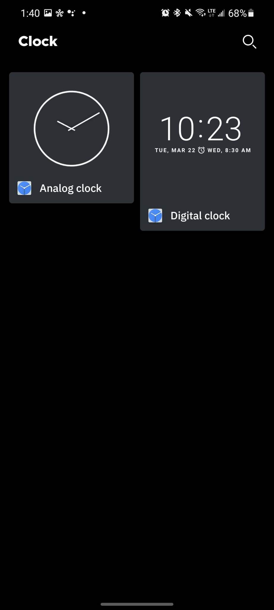
These are two of the oldest widgets on Android: analog and digital clocks. These clocks only come in white — I had to change wallpapers to get that analog clock even to show up so I could resize it — and only the digital clock will show the next alarm. These widgets, above all others, need an overhaul to adjust to system colors or at least dynamically change between light and dark based on the wallpaper/dark mode. Granted, there are probably ten different clock widgets available on my phone right now without counting the medley of custom ones in KWGT, but c'mon, Google, these deserve at least a little love!
Google Drive: D
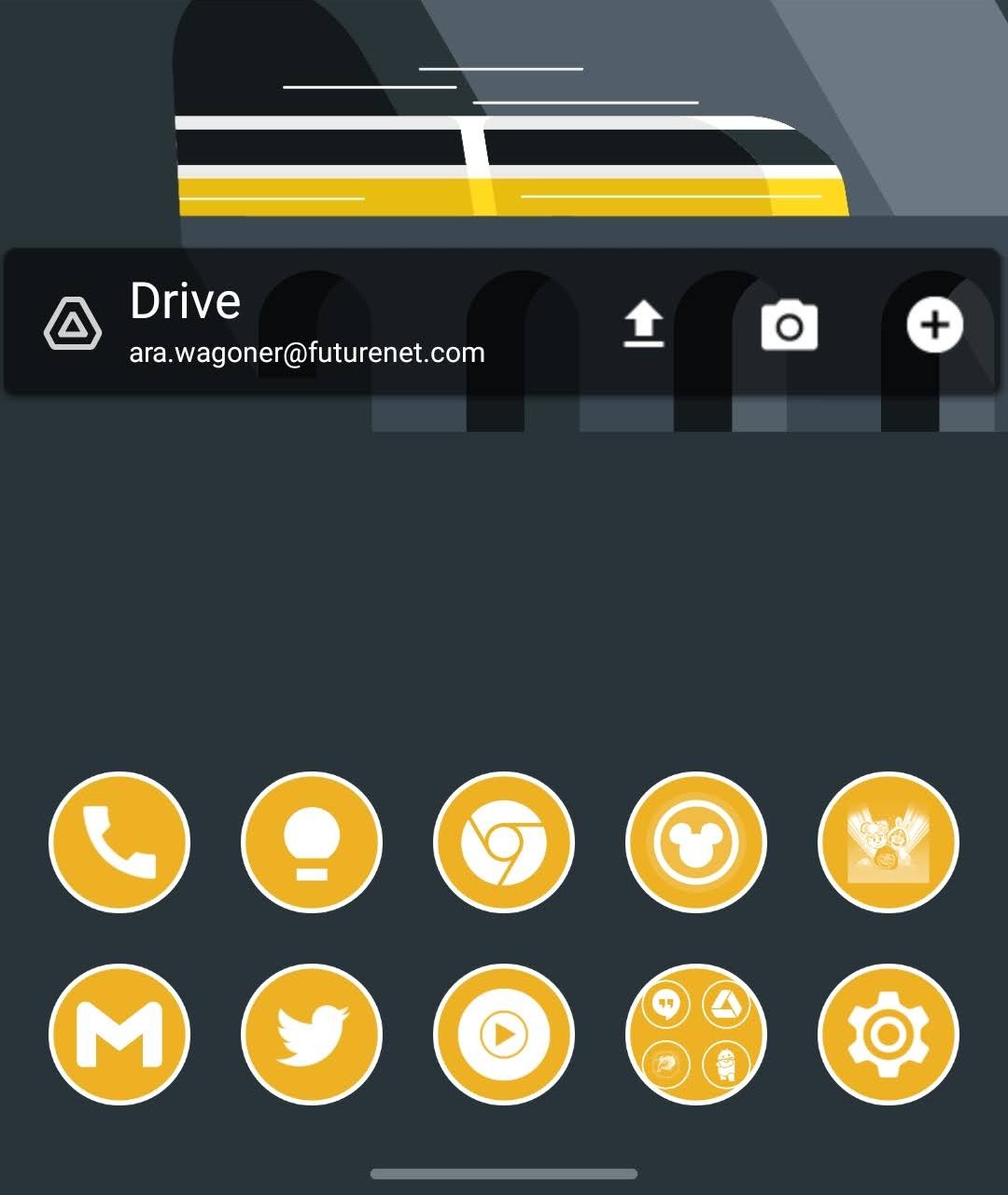
The Google Drive is another holdover from a previous era, a transparent bar with buttons to upload a file, scan in a new document, or create a new Google Drive document/folder. This widget needs to be updated and expanded, either showing the most recent files for easy access or showing stats for your Google Drive use in addition to the new document buttons. Like Google Clock's widgets, this widget doesn't respect light/dark mode, and that needs fixing, too. The iOS widget for Google Drive should replace this old-style widget at the very least, but I'd like to see a shortcut to favorites or recent documents, too.
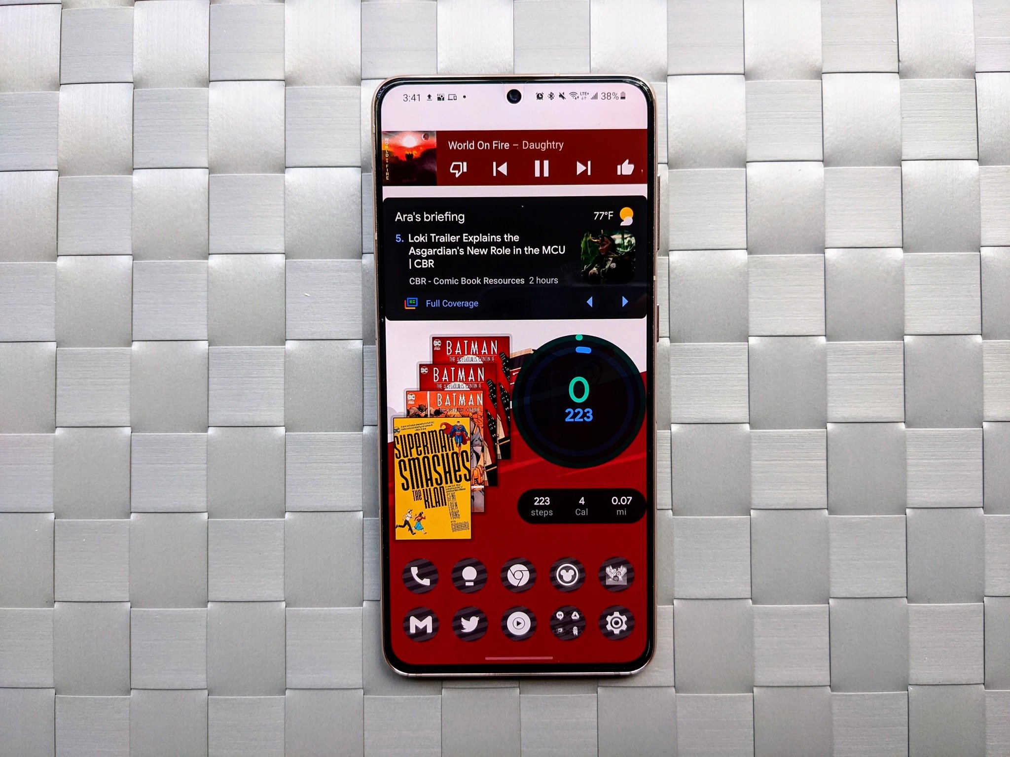
Google Fit: A
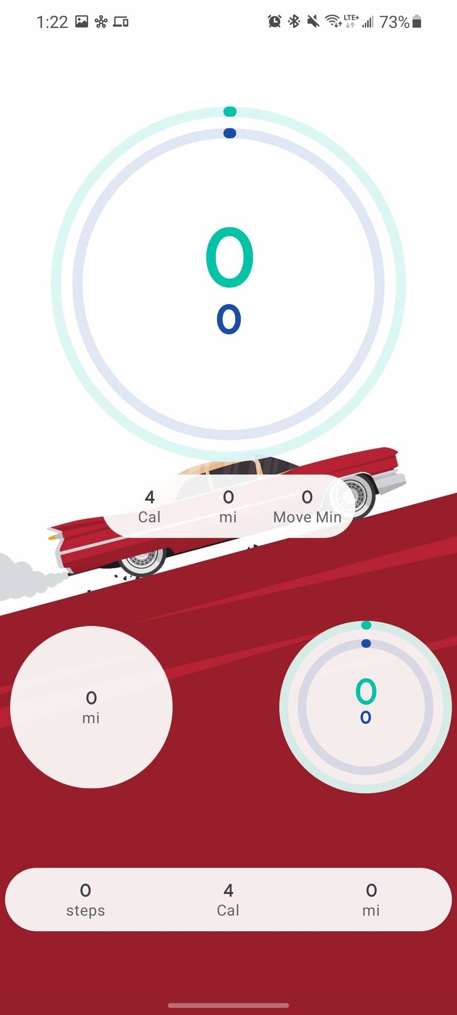
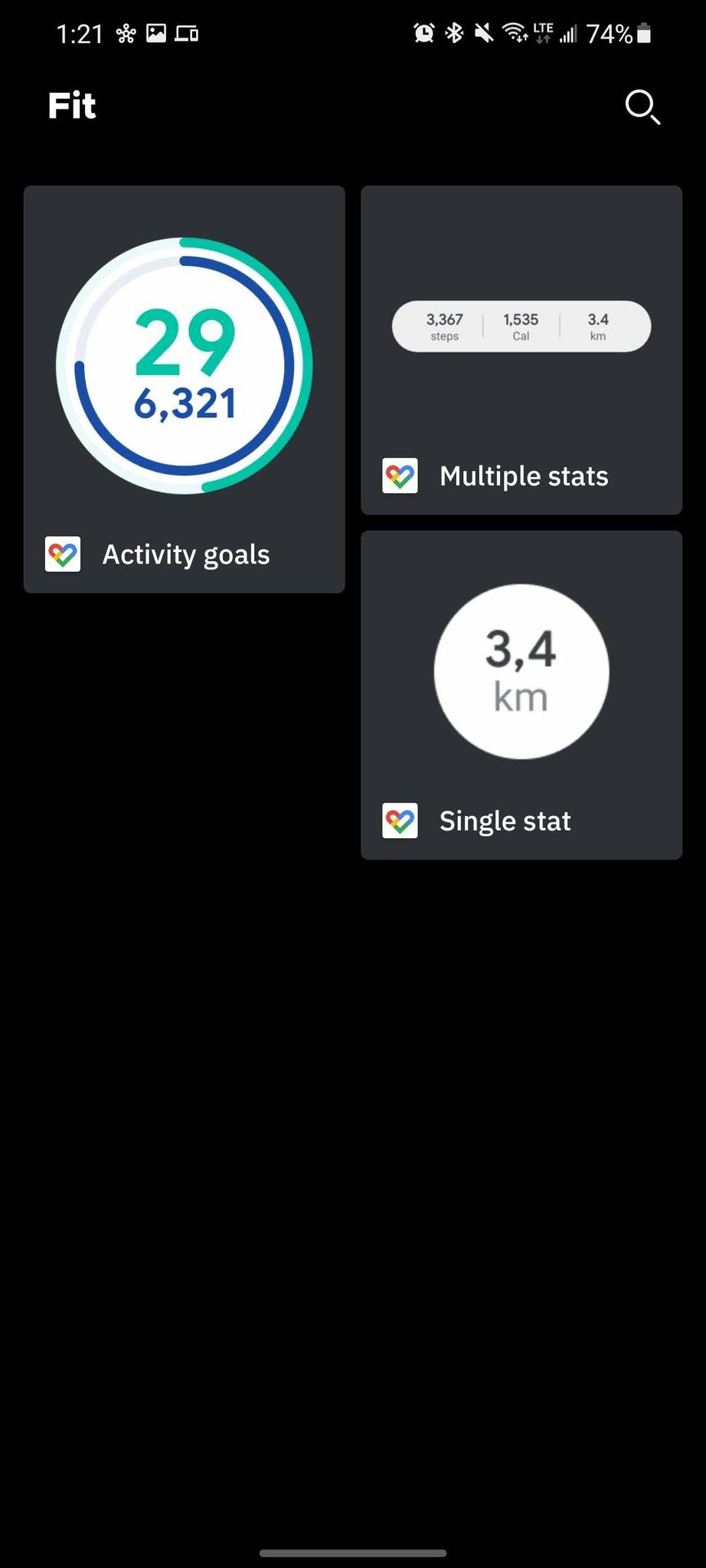
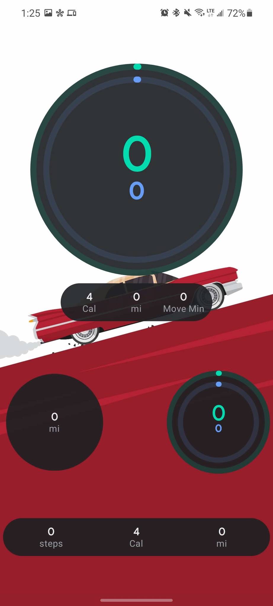
You can add three Fit widgets, but I added the Activity goals widget twice to illustrate how the bar at the bottom will vanish when the widget is shrunk down small enough. Like Google Chrome, all Fit widgets swap between white and charcoal grey depending on dark theme, but the opacity here is less translucent. All three widgets will adjust based on size, but there's more wasted space on the Activity goals given the smaller bar below the circle.
I wish that the single stat widgets made the numbers larger and didn't have as much wasted space inside the circle, but they're not bad when set as 1x1 widgets. Since these are all rounded widgets already, it'd be nice to see them match the Chrome widget's translucence and match system theme colors rather than just white/grey.
Google Fi: A-
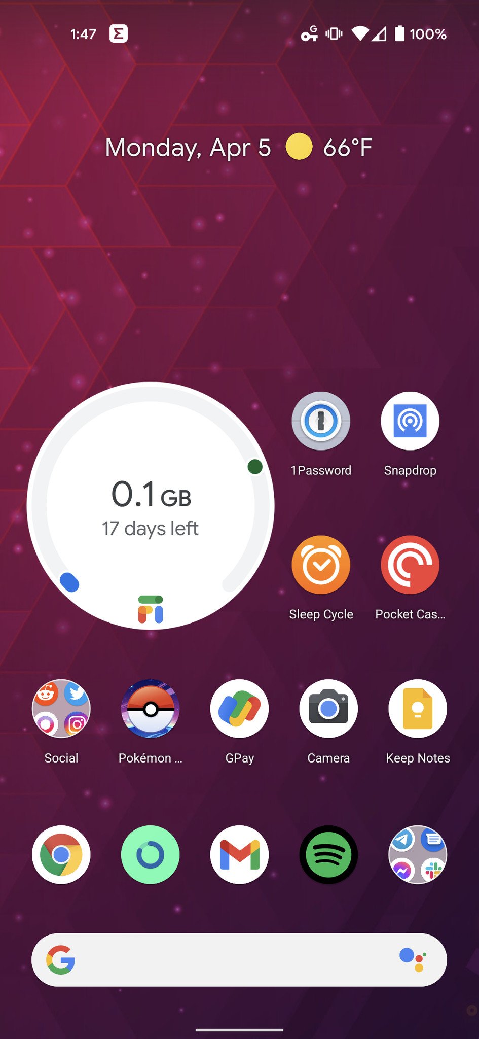
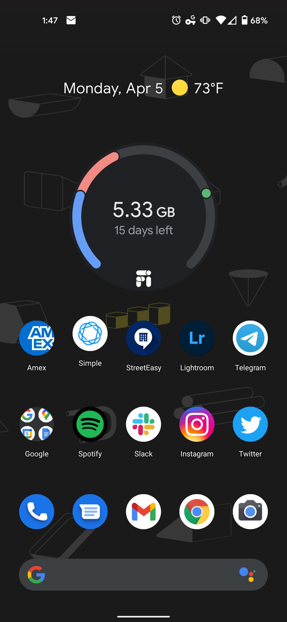
Google's MVNO has a single widget that acts and looks a lot like Google Fit's Activity goals, except the background isn't slightly transparent. Instead of your steps, it measures what data you've used — and other users on your family plan — and how long until the end of your current cycle.
Like Fit, this widget doesn't really need much fixing, but if it swapped over to a pill-style widget with more info besides just how much data you've used — current network type and signal strength, for example — that could make much better use of the space than a simple circular gauge.
Gmail: B-
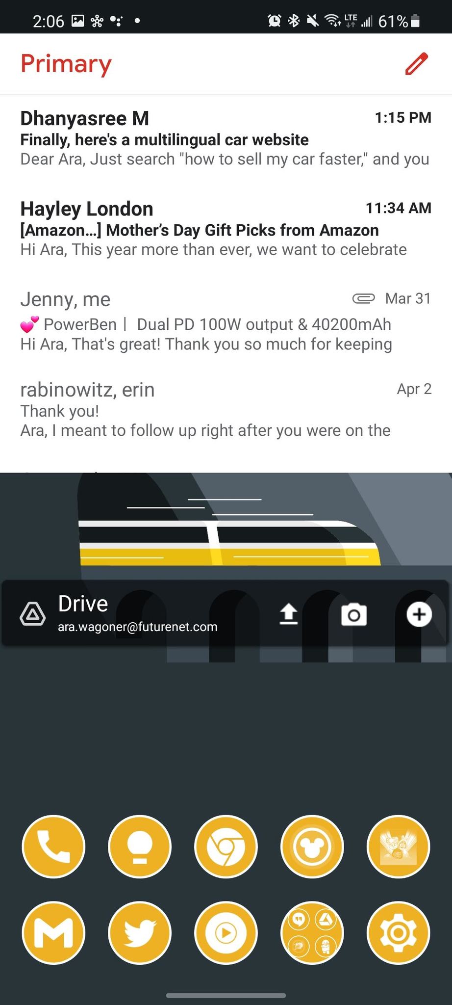
Gmail's widget can display any one designated tab/folder of your Gmail inbox, and you can open recent emails or start drafting a new email from this widget. While this widget does respect your phone's light/dark theme, it's actually a tiny bit broken at the moment: if you add the widget while in Light mode, the sender on unread emails will turn invisible in dark mode. If you're in dark mode when you add the widget, the sender becomes hard to read but is still visible when you swap to light mode.
We need that bug quashed, but more so, we need this widget to look better and be capable of more. For instance, you should be able to delete junk emails without having to open the full Gmail app.
Google: B
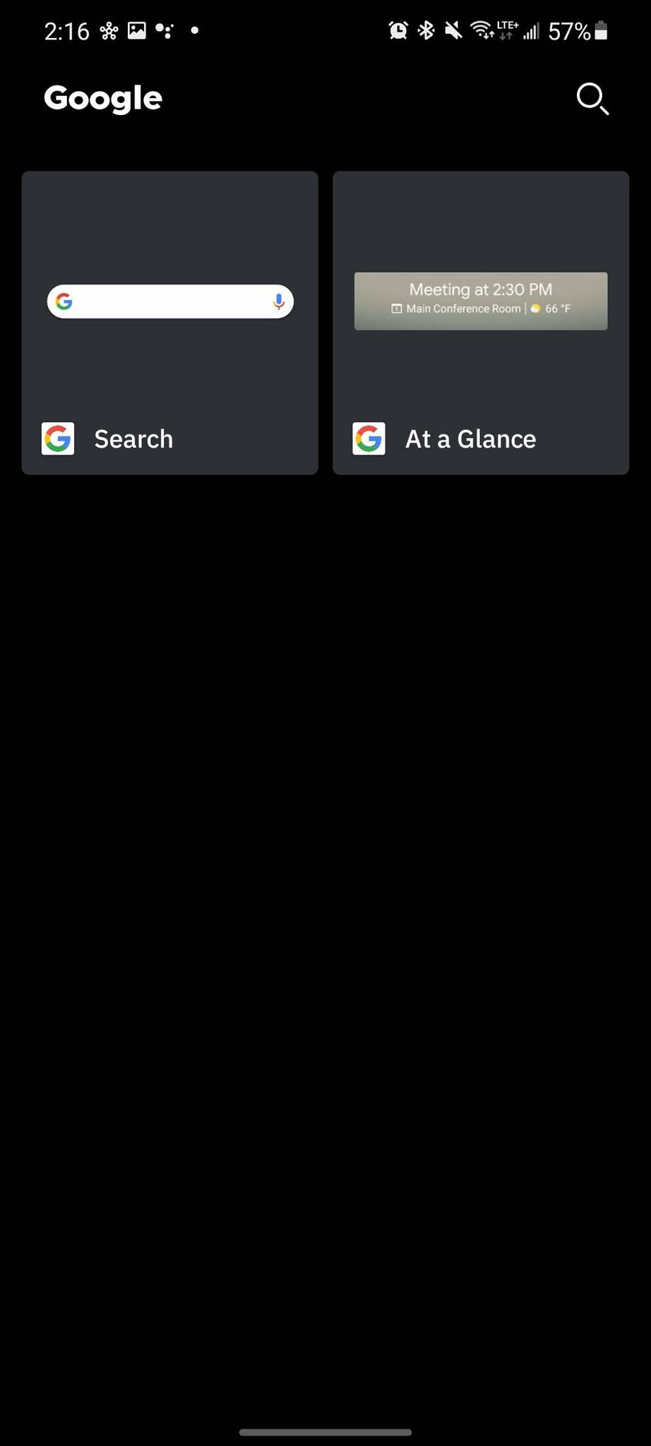
The main Google search app comes with two widgets: the Google search bar and the previously Pixel-exclusive At a Glance widget. Like the Clock widgets, At a Glance is always white text, but at least it has a drop shadow on it so that it's visible on white wallpapers. Tapping the date will take you to the calendar app — whichever one you set upon first clicking on it — and tapping the temperature will take you to the weather forecast inside the Google Search app. I wish At a Glance would pull in more meetings and alarms, but c'est la vie.
The Search widget is kinda bland compared to the ones most launchers come with these days: translucent white or charcoal grey with a technicolor Google G icon and a microphone for voice searches. If every launcher and their mother can color-tint the search widget to match the wallpaper or launcher theme, I know for damn sure that Google can do the same or better. "If it ain't broke, don't fix it" doesn't jive with Android widgets anymore.
Google News: C
This widget has potential, especially since it's one of the newer Google widgets, but no matter how big you resize it, it'll only hold one widget on the screen, which is a damn shame. It'll only cycle through five headlines, too, with no way to dismiss a story without opening the full app. The widget respects light/dark mode just as most of the others do, but Google needs to take better advantage of space when the widget is anything other than its tiniest sizes.
Google Play Books: F

The Google Play Books app hasn't changed since my original Nexus 7 tablet back in 2012, which is impressive considering half of the Google Play apps are now rebranded or completely gone. The four books stack in a carousel that you can rotate by swiping up and down on the books. Once upon a time, that gesture was fine for this, but these days swiping up and down on your home screen usually opens the app drawer or the notification shade.
Google Books needs a proper widget with shortcuts to your last-read books and most recent audiobook, a widget that adhered to Material design standards and won't get its gestures confused for system UI gestures.
Google Keep: B+
I've been a lover of Google Keep for years and years, and the Keep widget graced the home screen of my very first Android phone — I miss you, Soarin! — and the widget hasn't really changed since then. The widget allows you to see all notes or filter by tag, and you can also add new notes in various types. This widget needs a bit of polishing — some rounded corners and maybe a more glanceable list format rather than the card-style layout it currently uses — but at least Keep is more useful than its recently resurrected rival.
Google Tasks: B
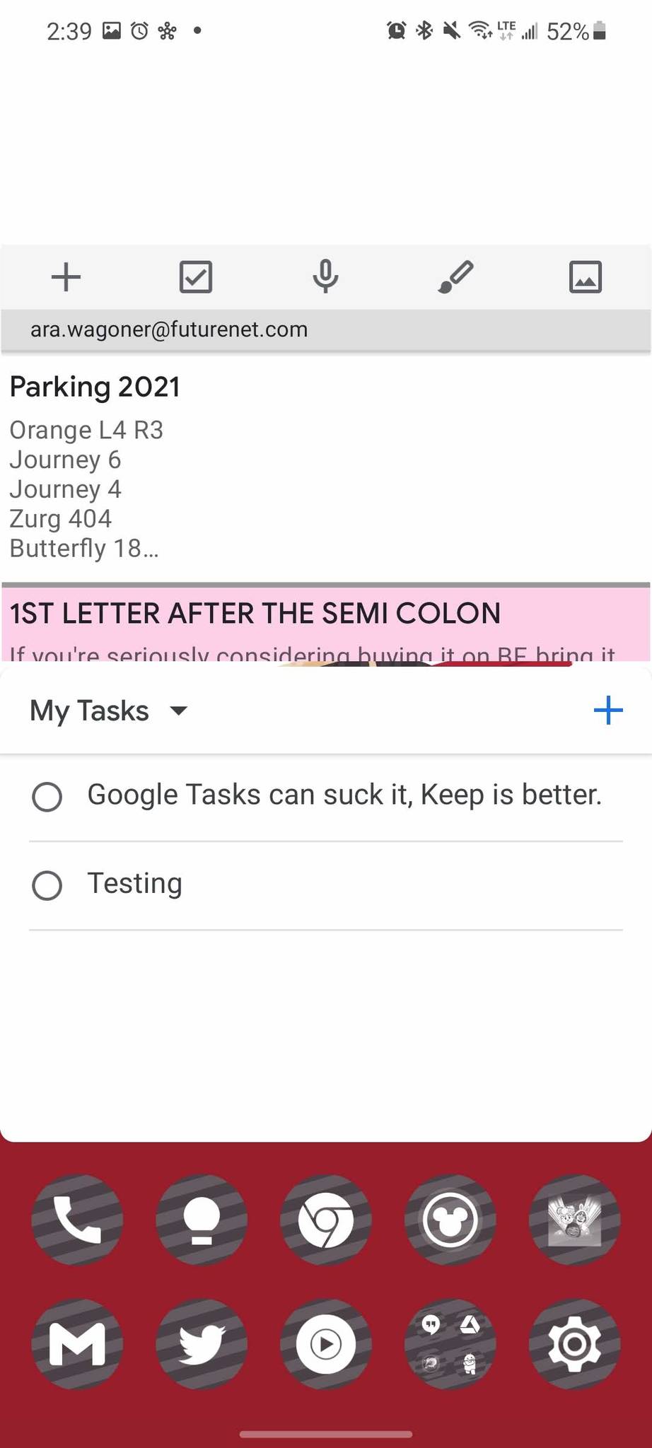
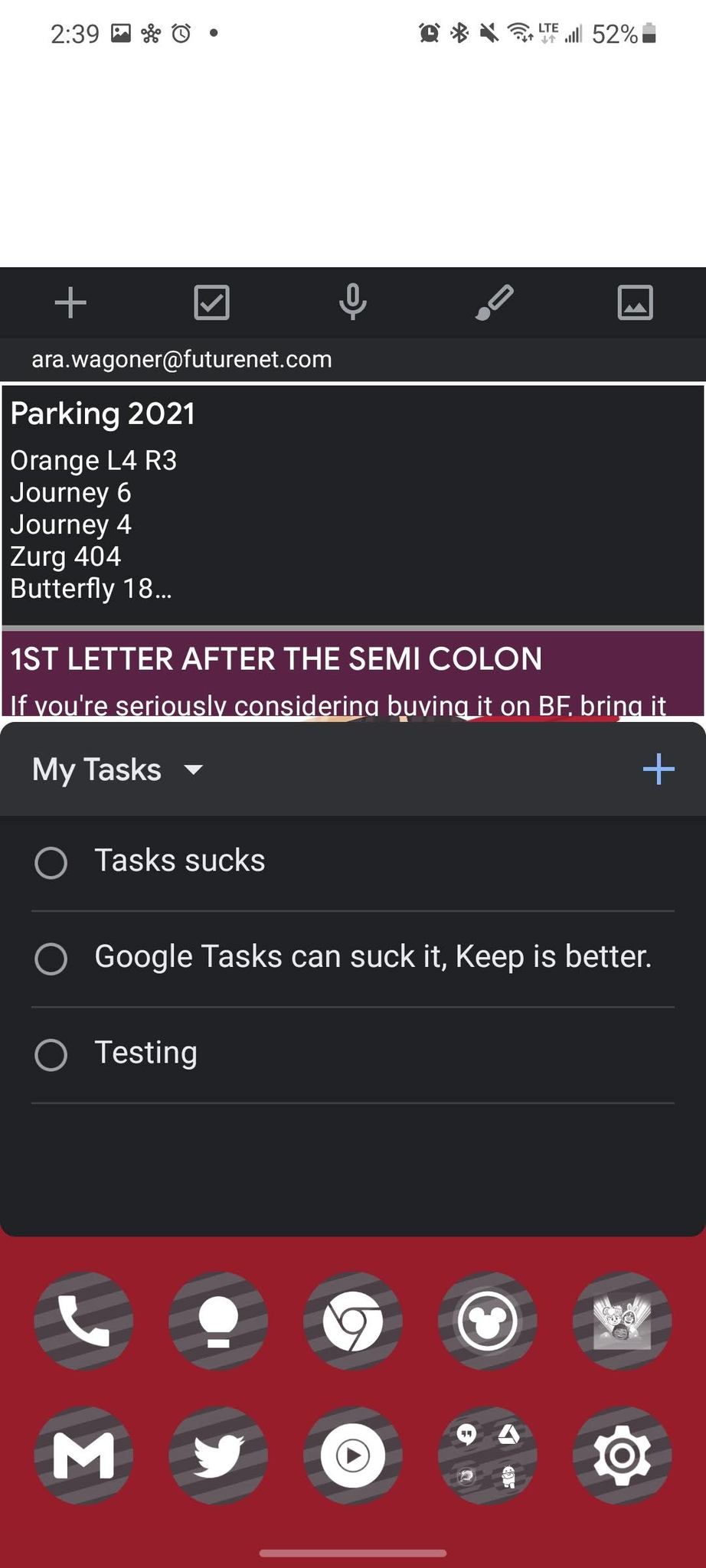
Google Tasks is a pale imitation of Google Keep. Google should have left it in the pre-Material Design basement to rot, but since Tasks got a refresh a few years ago during the Gmail overhaul, that included a widget, from which you can see your most recent tasks and check them off as you go. You can also add new tasks directly in the widget rather than having to go into the full app, but be careful. If you don't tap exactly on the checkbox, it opens the app, and if you check something off prematurely, you'll have to open the app to uncheck it and add it back to the task list.
YouTube Music: B-
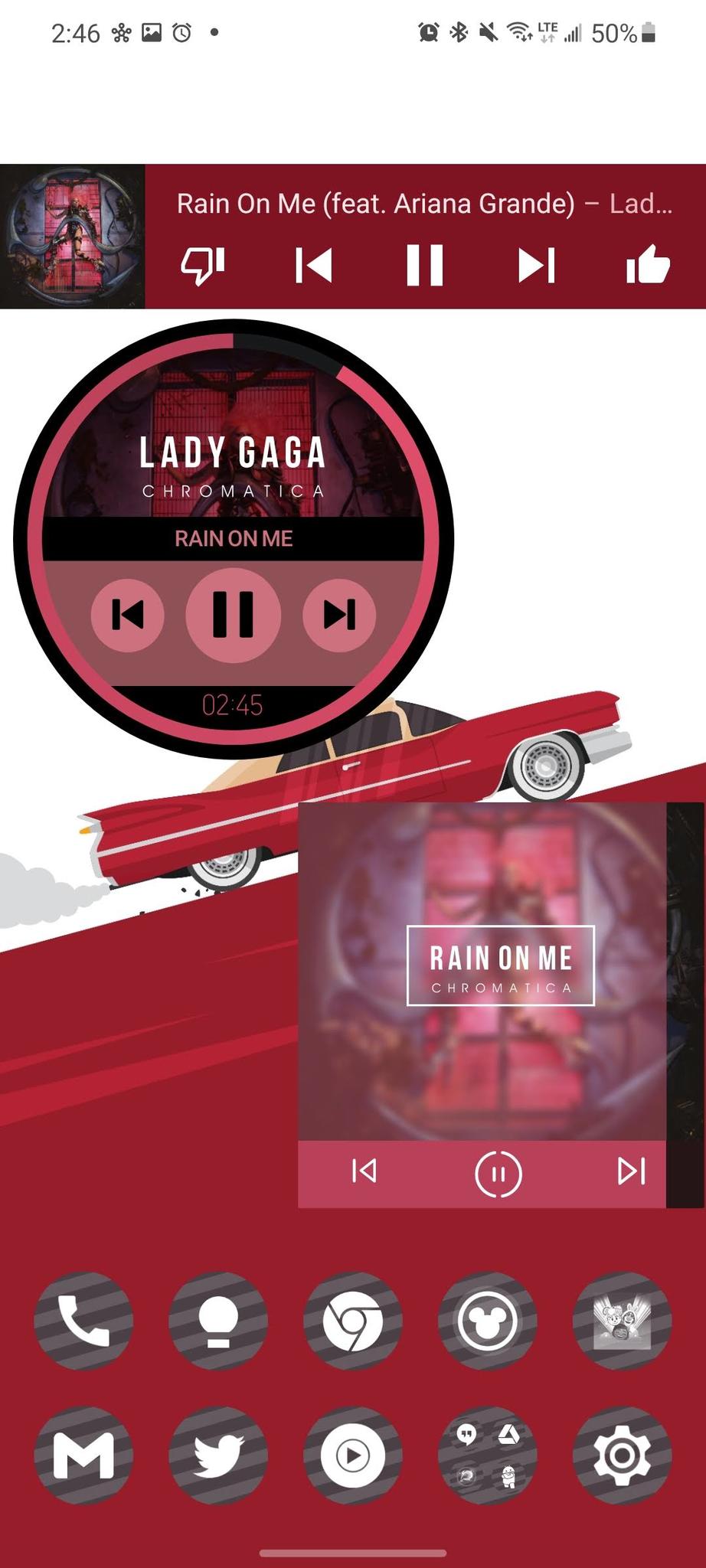
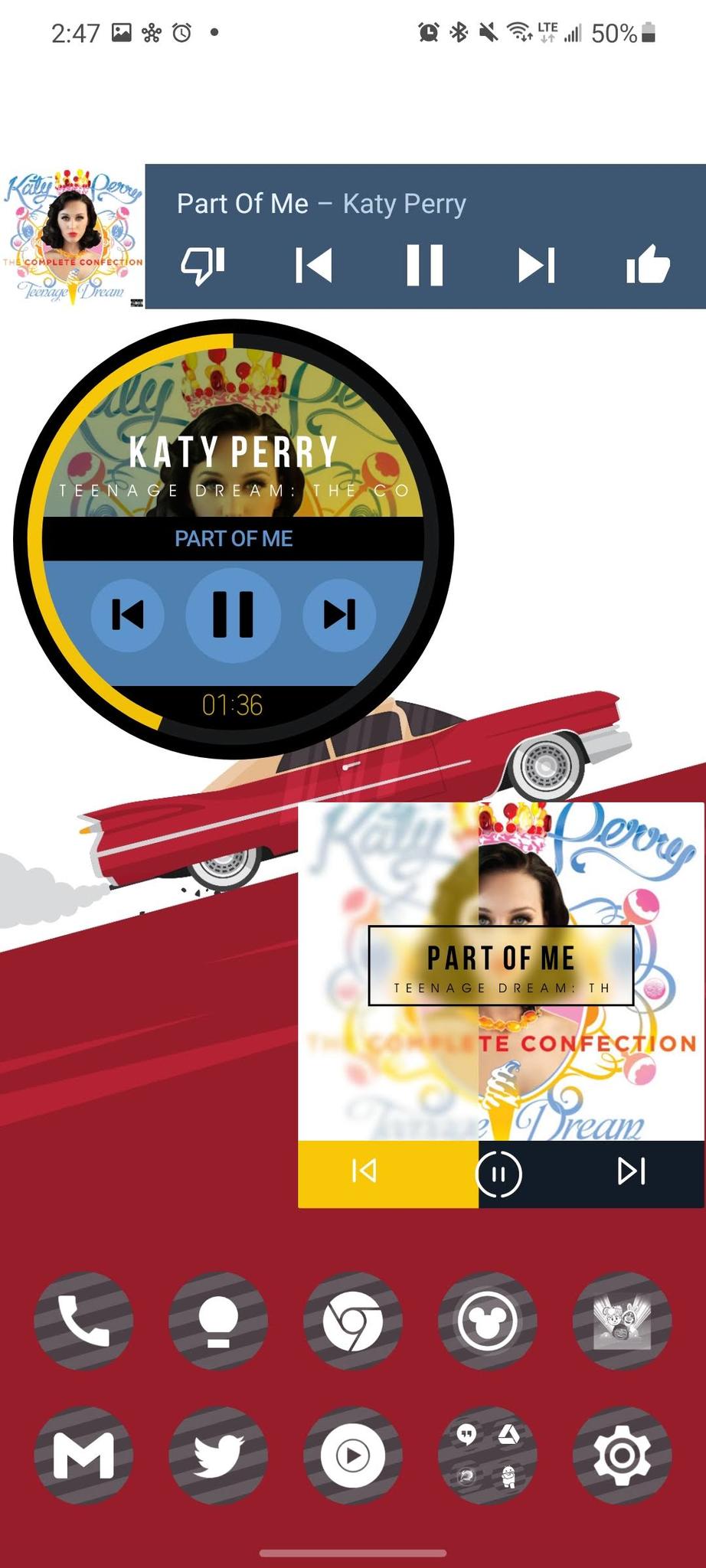
YouTube Music has basically the same widget as Google Play Music — rest in peace, you loveable orange lug — except it reversed the thumbs up and thumbs down positions. No matter how you resize the widget, it won't get any bigger, which is a shame. I wish YouTube Music would give us a bigger, bolder widget option, like the two widgets below it that I personally use from time to time via KWGT and the Melodi for Kustom. At least the widget recolors to match the album art, but the widget is so small and could be so much more lively!
Look to the future — via iPhone
If you want to see what the future of these widgets might look like, check out Google iPhone widgets for apps like Google Photos — which still lacks an Android widget — YouTube Music, Google Drive and Google Fit. These widgets are all made according to Apple's strict standards, but Google could use them as a springboard for their Android counterparts this fall. Or at least, that's the hope; god knows the Android teams for Google's apps haven't given widgets the time of day in years.
What do you want to see from the next generation of Android widgets from Google? Are there any styles or mockups you've seen that you wish Google would pick up from the theming communities? Do you think widgets are a waste of time after so many years of no improvements? Let us know in the comments and share the widgets you use on your home screen.
Source: androidcentral