A look back at the past decade of Android design language.
The Android OS has been around since 2008, and in that time, its UI has been reinvented several times over. The original Android 1.0 interface that debuted on the T-Mobile G1 — the very first Android phone — was barebones and pretty ugly by modern standards. It wasn't until Android 4.0, three years into the OS's lifespan, that there was any kind of overarching design language for Android phones.
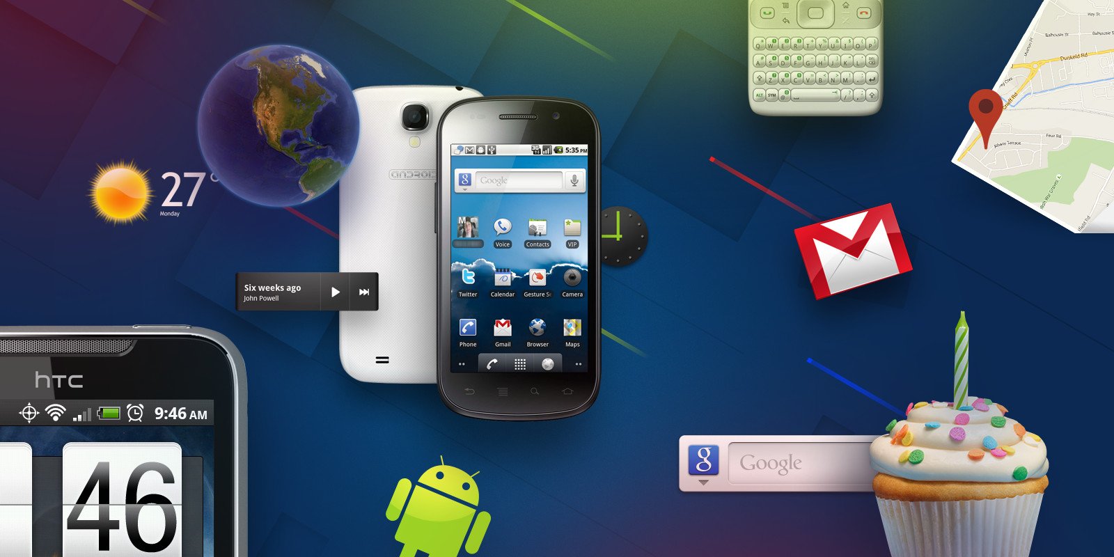
The look and feel of Android has been constantly evolving since then, often with baby steps forwards, but sometimes with giant leaps ahead, as occurred with the introduction of Material Design in 2014. Android 12 gives us the platform's third big, all-encompassing redesign in the form of Material You — an ambitious effort to make Android more personal, with individual color schemes plucked from the Material palette.
As we enter the fourth design era of Android — following the early days, Holo and Material Design — it's time to revisit the past 13 years in Android UI and remember how we got here.

For the first two years or so of its existence, Android lacked any strong design direction. From Android 1.0 to 2.2 Froyo, the look and feel of the OS was best described as generic, functional, and bland. Seeming to take inspiration from old-style smartphones of the time, the early Android look consisted of chunky icons, gradiented menus, and a whole lot of grey.
The look and feel of stock Android just didn't matter that much.
This no-frills aesthetic made sense for the small, low-resolution smartphone screens of the late 2000s. While Google was (sort of) shipping phones at that time, in the form of the T-Mobile G1 and eventually the Nexus One, most consumers would experience Android through the lens of an all-consuming manufacturer skin like HTC Sense or Samsung TouchWiz. The look and feel of stock Android just didn't matter that much when the best Android phones aren't using anything close to it.
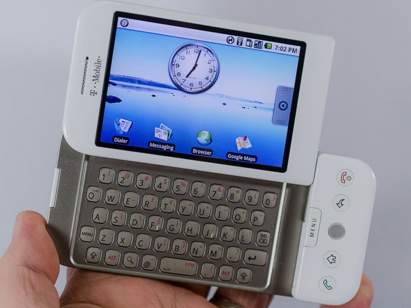
Nevertheless, looking back at the software of the T-Mobile G1, many of the key, recognizable Android design elements of today are present. Multi-page home screens with widget support, the app drawer, and the notification pull-down are all there, even if they're wrapped in a UI that more resembles a 90s desktop computer OS than the Android of today.
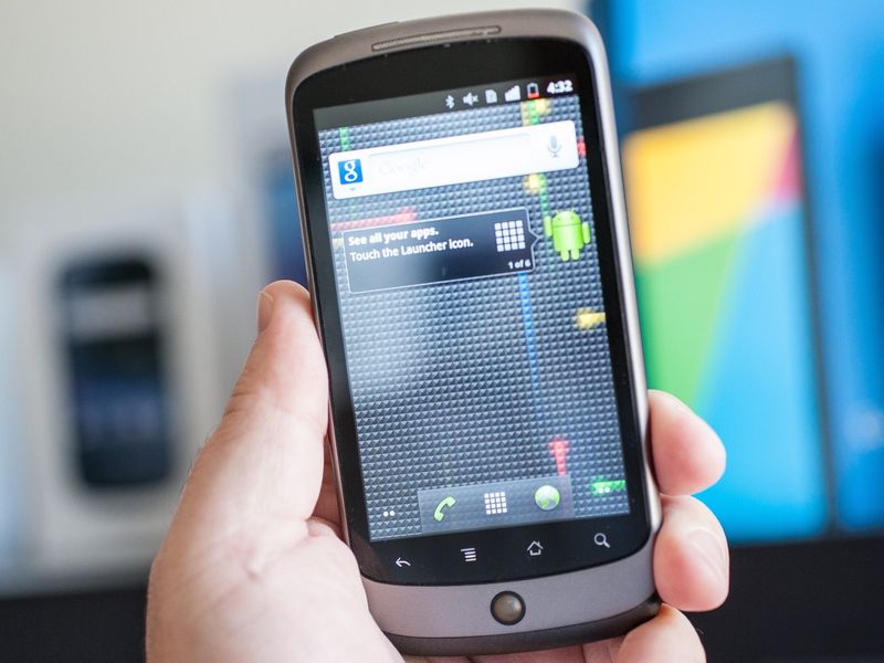
Google's launch of the Nexus One smartphone coincided with some minor design tweaks to Android 2.1 Eclair, incorporating quick shortcuts to the Phone app and Browser alongside the app drawer icon. The first Nexus phone also got a fancy 3D-animated app grid. But basically, this was stock Android until late 2010: fairly dull, cold, and utilitarian.
The arrival of ex-Palm designer Matias Duarte at Google — first as design director for Android, then for the whole of the company — set the course for Android's UI over the following decade.
Duarte was hired right before Google was about to ship Android 2.3 Gingerbread and the Nexus S phone, so his influence upon Gingerbread was limited. Nevertheless, Android 2.3 was the most significant design overhaul Android had yet seen, with darker colors throughout in a nod to the growing popularity of OLED screens. The Android green hue was used as an accent color to highlight icons, and menu presses were punctuated by flashes of orange. Otherwise, this was a continuation of the old-look Android.
The arrival of the first tablet-specific version of Android changed everything, with Duarte's influence clearly seen in early 2011's Android 3.0 Honeycomb release. Honeycomb powered early iPad rivals and sported a bold sci-fi-style interface with a blue and deep purple color palette.
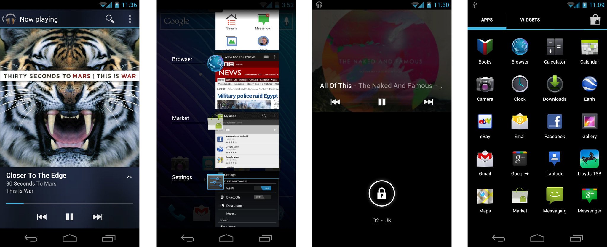
This version introduced us to on-screen keys, the navigation paradigm that remains with Android to this day on some phones. Doing away with the old menu and search buttons from Gingerbread and earlier releases, Honeycomb devices could be navigated with three virtual navigation keys: home, back, and recent apps. Pushing the latter fired up Android's newly revamped task-switcher, showing a small preview of running apps in a scrollable list.
Honeycomb, rushed to market in an attempt to combat the iPad, acted as a kind of prototype for what arrived later in 2011: Android 4.0 Ice Cream Sandwich and the new "Holo" design language — short for holographic.
'What is the soul of Android?'
Matias Duarte appeared onstage at the Hong Kong launch event for Google and Samsung's new Galaxy Nexus, the first phone running Android 4.0, to talk Holo.
Duarte told attendees that, as Google sought to lay the foundations for the next half-decade of Android, it asked its users what Android meant to them. It found that, in 2011, "while people like Android, people need Android, people didn't love Android."
And so Google asked itself, for the first time, "what is the soul of Android?"
"Android is enchanting. Something beautiful, seductive, something you can really fall in love with. Android is easy. It simplifies every part of my life. And Android should make me feel powerful and smart," Duarte told attendees. The new Android UI, with its Holo theme, was meant to exemplify these values.
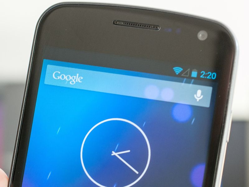
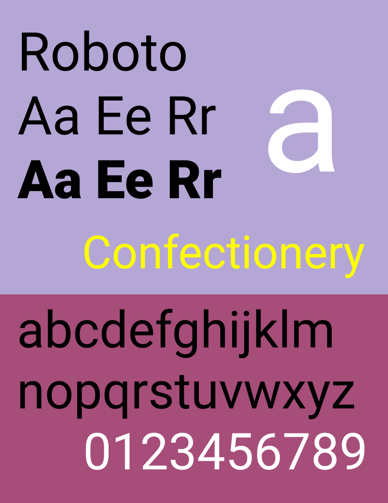
Holo built on what had been started in the Honeycomb release, adding the new Roboto font, a typeface that remains the default on most Android devices today. Unlike Droid Sans, which it replaced, Roboto was built for the high-density displays that were starting to become common at the time, giving a more modern appearance and pleasant reading experience. Elsewhere, the beveled edges and embossed buttons and menus were excised from Android, replaced with simpler, more geometric icons and UI furniture.
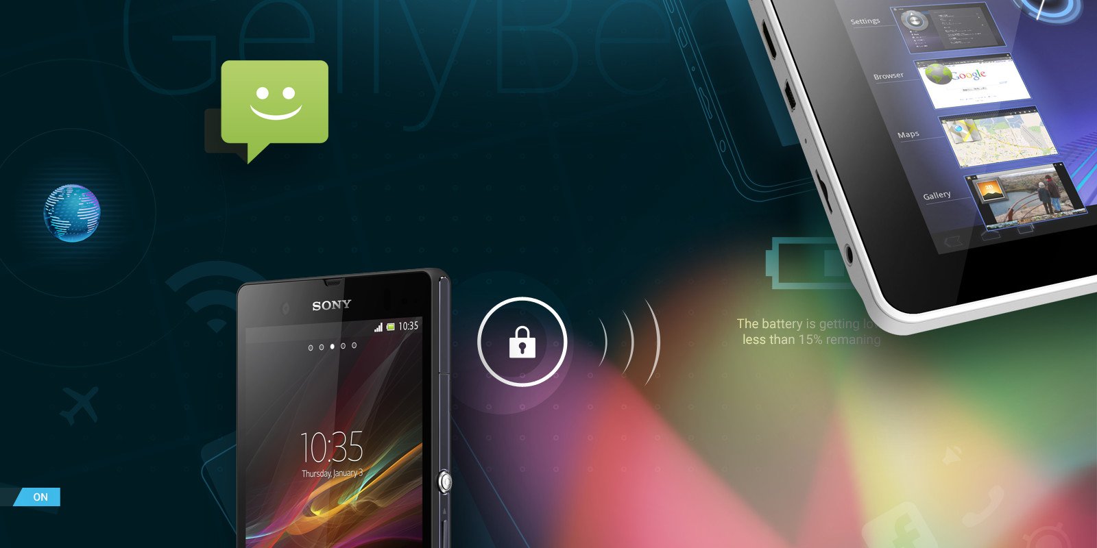
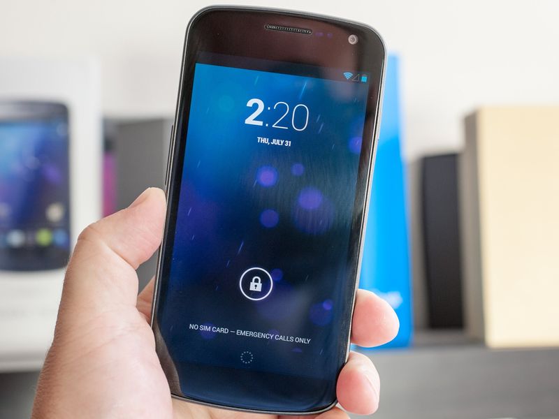
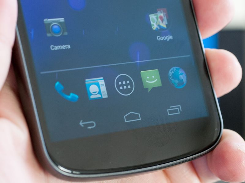
Holo Blue (a.k.a #33B5E5) was the primary accent color of Ice Cream Sandwich and the subsequent Jelly Bean release, making Android 4 seem sharp and futuristic, though distinctly less Tron-influenced than Honeycomb had been. The darker color palette from Android 2.3 and 3.0 remained, though, and seemed a good fit for the Galaxy Nexus, particularly with its expansive, contrast-heavy AMOLED display.
Most major Android manufacturers would continue to do their own thing, however. The likes of Samsung, HTC, and LG once again plastered Android with their own custom interface layers, often running roughshod over Holo in an effort to differentiate their products. As a result, a Samsung phone running Gingerbread looked pretty much the same as a Samsung phone running Ice Cream Sandwich. For example, on the Galaxy S3, the first major Samsung handset to launch after the co-branded Galaxy Nexus, you'd have to look really hard to see any of the work from Duarte and his team.
Early Holo was a fairly opinionated design language, though, which couldn't easily be married to a company's own design preferences. In stark contrast to one of the core tenets of Material You, the distinctive Holo blue was hard-wired into the Holo theme, with no way to change it on stock Android devices.
Android 4.4 KitKat tamed Holo somewhat, replacing blue accents with brighter whites, making for a better fit alongside apps, wallpapers, and icons using a more diverse color palette. And this would eventually segue into the second great big Android redesign that occurred in late 2014.

At Google I/O 2014, Matias Duarte, in his new role as VP of design for the whole of Google, unveiled the new Material Design language.
Material Design was "one consistent vision, for mobile, desktop and beyond," Duarte said. Just as Holo had arrived just in time for the higher-resolution mobile displays of the early 2010s, Material Design leveraged the improved graphical horsepower of the mobile hardware available in the middle of that decade. But it wasn't just for phones — Material Design would live on tablets, smartwatches, Chromebooks, and the web.
"We wanted a design that was clear and simple, and that people would intuitively understand," Duarte explained. "So we imagined: what if pixels didn't just have color, but also depth? What if there was an intelligent material that was as simple as paper, but could transform and change shape in response to touch?"
'What if there was an intelligent material that was as simple as paper, but could transform and change shape?'
"Digital paper" was at the heart of the original vision for Material Design: UI that resembled a sheet of paper, with subtle shadows to convey depth, while also being able to expand, resize, combine, and transition as needed. Each surface in an Android app could now have an elevation value, with the Android framework appropriately rendering lighting and shadows beneath this digital paper.
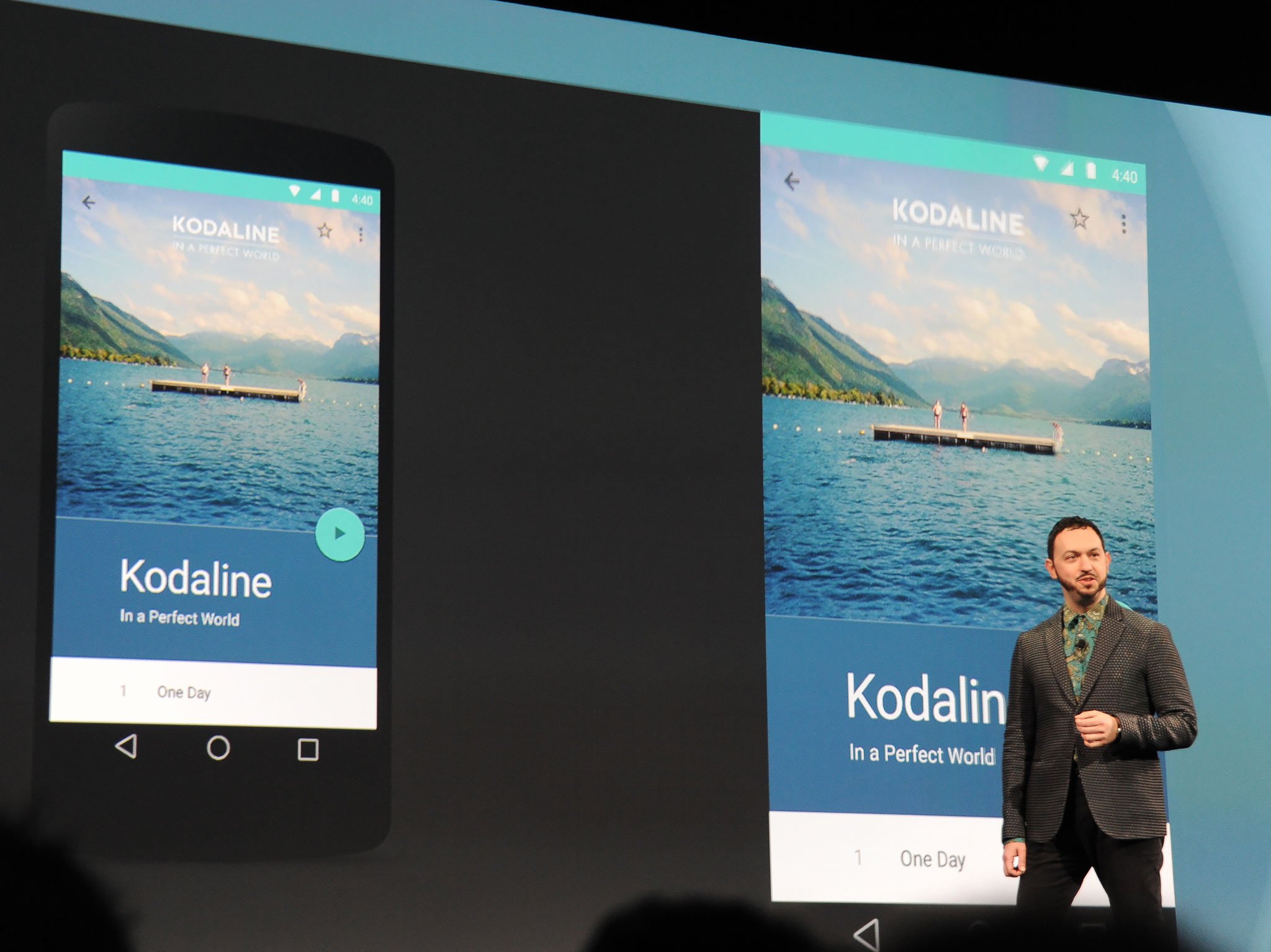
Material Design was presented as simple, geometric, and layered, with a bold color palette and delightful animations. Simple flourishes like a play button splitting into a pause icon when tapped or contact icons expanding into view as they load set a Material app apart from the earlier Holo design language and remain a part of Android today.
The original Material sizzle reel showcased this, along with highly vibrant hues and layer-heavy apps with slick animations that were never fully realized when the design language went live in Android 5.0 Lollipop. The real-world implementation of Material ended up being more conservative, as Google engineers scrambled to get the company's vast loadout of Android apps Material-ready. Android was a big ship to steer, and the "Materialization" of the OS and its apps ended up being a multi-year process.
Nevertheless, Material Design in Android Lollipop introduced several key design elements that persisted for more than half a decade: The floating action button was the go-to location key features like starting a new message in a texting app or adding an item to a list. And slide-out "hamburger" menus emerged as a favorite way to navigate between the major areas of apps. And the button press and overflow flourishes that debuted with Material Design in Android 5 stuck around all the way through to Android 11.
And with Google wielding more control over the Android ecosystem — and the new design language being more open to customization — Material Design was more readily incorporated into manufacturers' Android skins compared to Holo.
Material Design was always intended to move with the times.
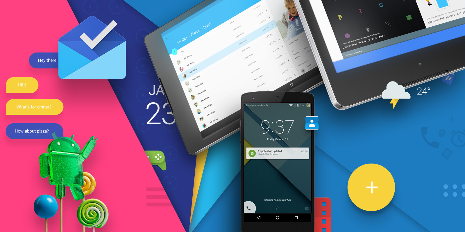
Material Design was never meant to be a static set of guidelines, though, and it continued to evolve in subsequent Android versions. The Android 6 Marshmallow release of 2015 pivoted away from the saturated colors we'd seen in the initial Material presentation. The Rolodex-style Recent apps menu was eventually decommissioned in Android 9. And "Hamburger" navigation menus clashed with Android 10's gesture navigation and have now been retired from many apps.
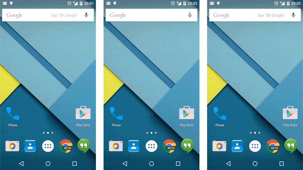
In 2016 Google debuted its first Pixel phones, leading to a further evolution in Material Design and a divergence from the original 2014 vision. As subsequent Pixels arrived, Google the hardware maker looked to differentiate its phone software further. Google apps became less colorful and instead pushed a clean white and blue color scheme. By 2020, most core Google apps like Photos, Gmail, News, and Maps had adopted this "Material Theme" aesthetic, along with iPhone-like bottom navigation buttons.
The Google apps of 2020 were a far cry from the colorful Material prototype shown in 2014. Fortunately, though, a more vibrant Material makeover was planned for Android 12 in 2021.

Seven years on from the debut of Material Design, the Google I/O conference was once again the venue for a major Android design announcement. And Matias Duarte returned to the stage in Mountain View, this time to showcase the next iteration of Google's design language in Android 12 Material You.
"Instead of form following function, what if form followed feeling? Instead of Google blue, we imagined Material You — a new design that includes you as a co-creator, letting you transform the look and feel of all your apps."
'Instead of Google blue, we imagined Material You.'
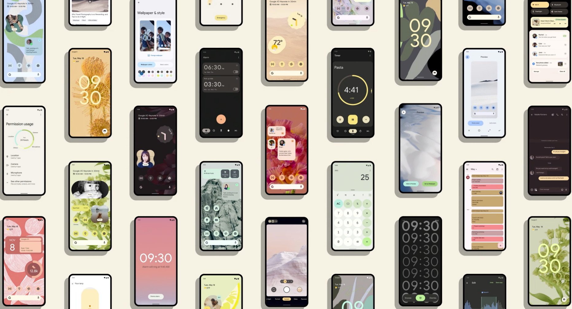
The magic behind Material You was a project known internally at Google as "Monet." Monet could examine your chosen home screen background, pick out key colors from the Material palette and use them to customize all the apps on your phone. More muted hues would be used for backgrounds, while vibrant, eye-catching colors might be applied to important buttons or switches.
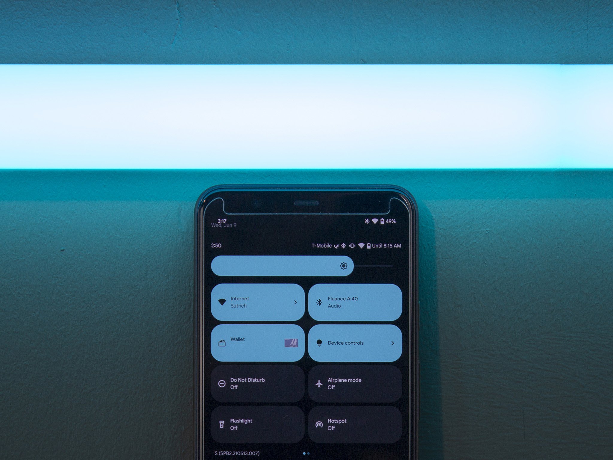
In contrast to Material Design 1.0's "Digital Paper," Material You appears flatter and more abstract. The layers of the UI are still there, as evidenced by the overlapping levels of quick settings buttons, notification panels, and borders when pulling down Android 12's notification shade.
But the shadows and sharp paper-like edges of Android Lollipop are gone, replaced with rounded corners with wide radii. Even home screen widgets have been overhauled with rounded corners. Material You also acts as an antidote to the often dull-looking Google apps users had become accustomed to in Android 10 and 11. Android 12, Google claims, can help you pick a customized palette that it knows will look good in apps, menus, and even home screen widgets. It's a more personal, more expressive design approach for what is, after all, the most personal computer most people own.
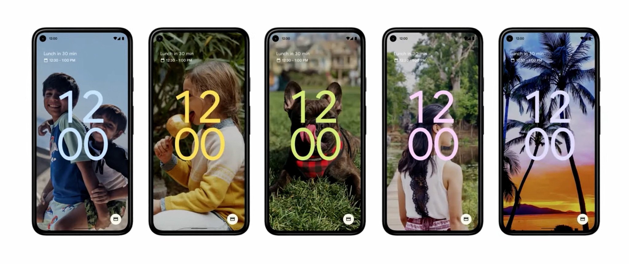
And while the old faithful Roboto typeface is still used in places, Material You emphasizes Google Sans, the company's official font, which packs more personality. Google Sans is used everywhere, from icon captions to menus in the Settings app, and is scaled up on Android 12's lock screen to fill the display with a colored clock when there are no pending notifications.
A bold new direction for Android design, but will the manufacturers jump on board?
The animated flourishes in Material You are also a natural evolution of early Material Design. The Ambient Display clock springs to life when the phone is picked up, becoming bolder and colored. And depending on how you lock or unlock your phone, you'll see an animated aura accompanying the action.
Material You debuts in Android 12 on Google Pixel phones in late 2021, and it's likely some other manufacturers will incorporate it into their Android skins as well as updates roll out. However, just as it was with Holo and Material Design, there are no guarantee phone makers will follow Google's lead. Android 12 users will also have to wait for developers to update their apps to support Material You's palette-swapping capabilities. If the transition to Material Design in 2014 is anything to go by, that could take some time.
Nevertheless, what we've seen of Material You so far gives Android in general — and Google Pixel devices in particular — a strong design identity, with a design language well fitted to the phones, watches, tablets, and other smart surfaces of the 2020s.
If history is any indicator, we'll be checking in again somewhere around 2026 to learn where Material Design is headed next.
Source: androidcentral